The Brief
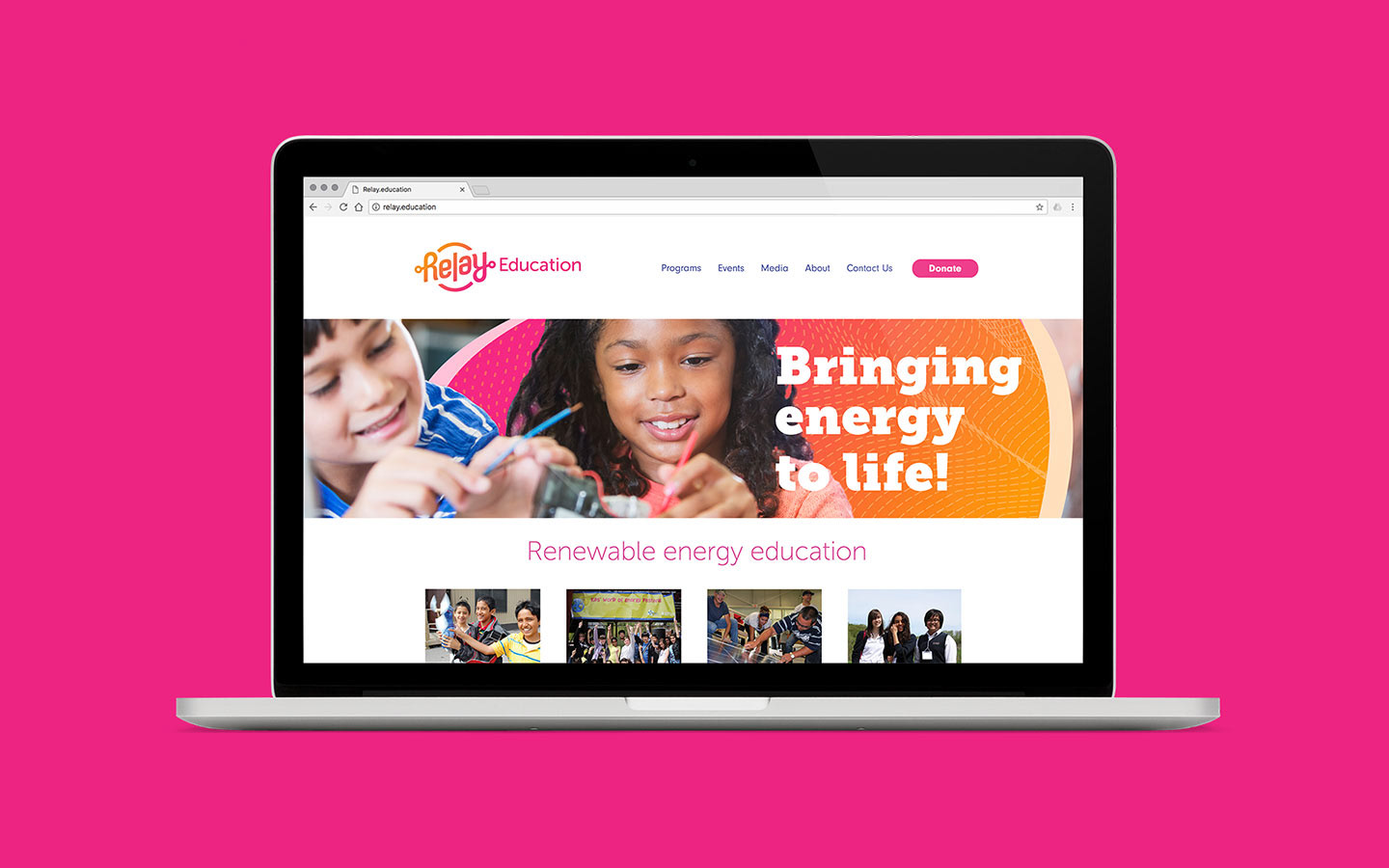
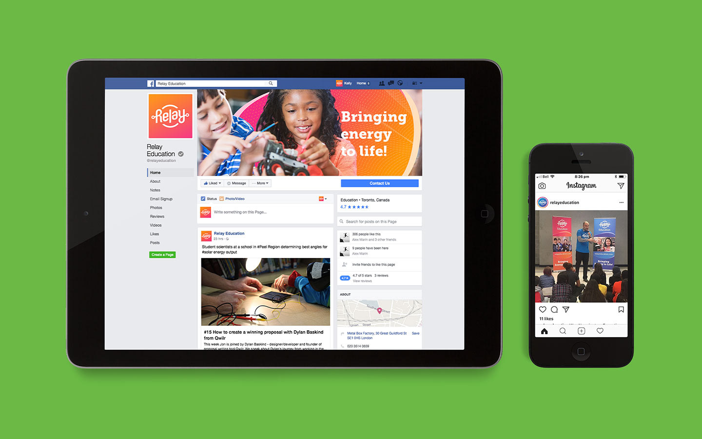
In 2017 we responded to a request for proposal from TREC Education, and won the bid to rename, rebrand and reposition the Canadian charity. After research, exploration and a renaming process, the charity was renamed; Relay Education.
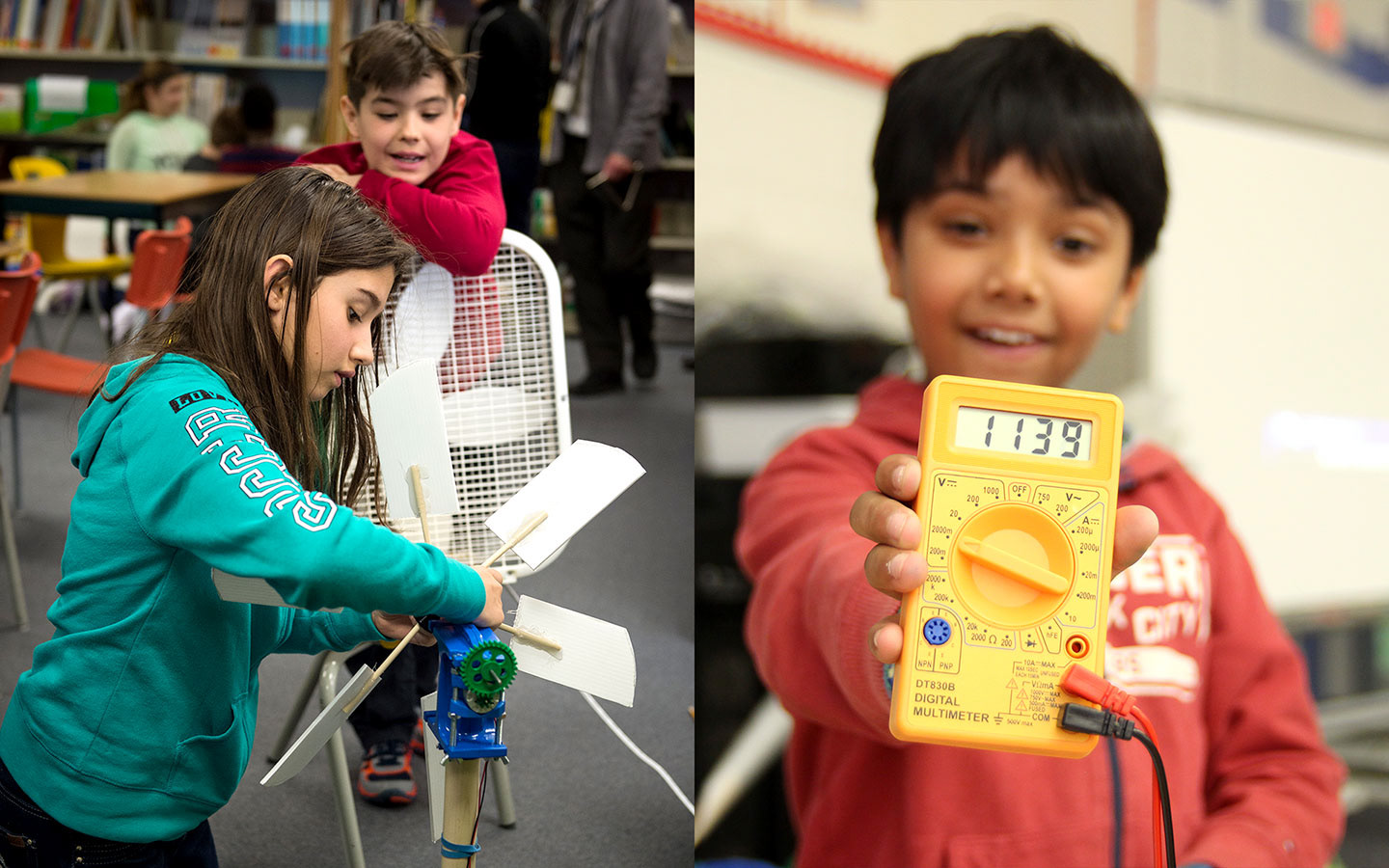
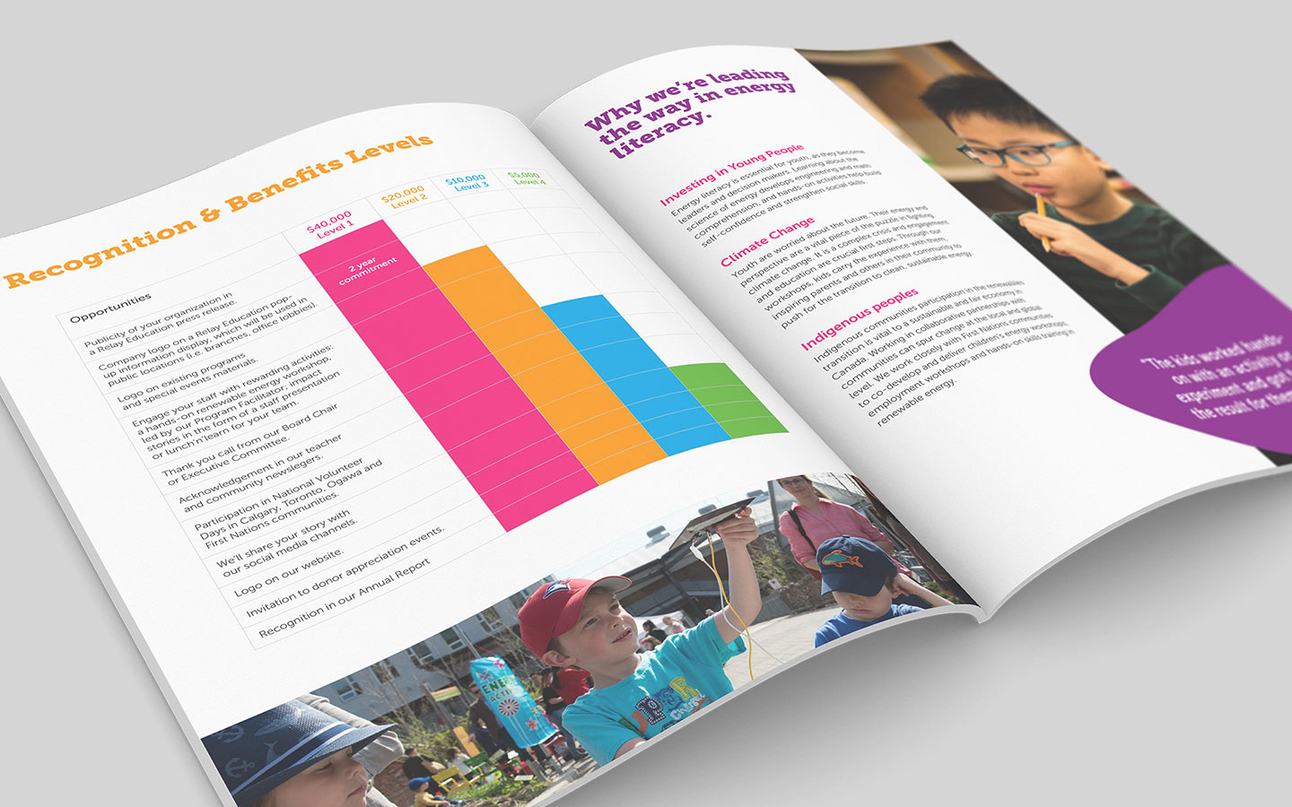
Relay are a fun organisation with a serious mission; Delivering innovative, hands-on quality programming about renewable energy in classrooms and communities all across Canada. Relay creates systemic change for a greener future whilst fostering the next generation of renewable energy leaders. The charity directly engages more than 15,000 students and adults each year.
Challenges & Goals
As a charity we had to be conscious of production budgets. One of the key goals was to communicate Relay's mission to educate, inspire and assist individuals and communities in building a 100% renewable energy future.
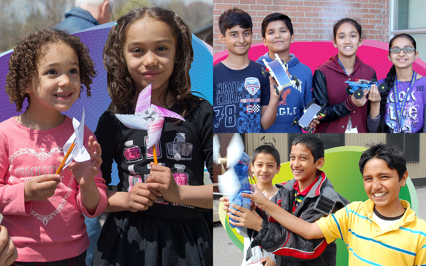
In early conversations the Relay team expressed an interest in finding a solution that would align with their hands-on, tactile experience the children have and something that would have a 'wow factor' for the kids
Solution
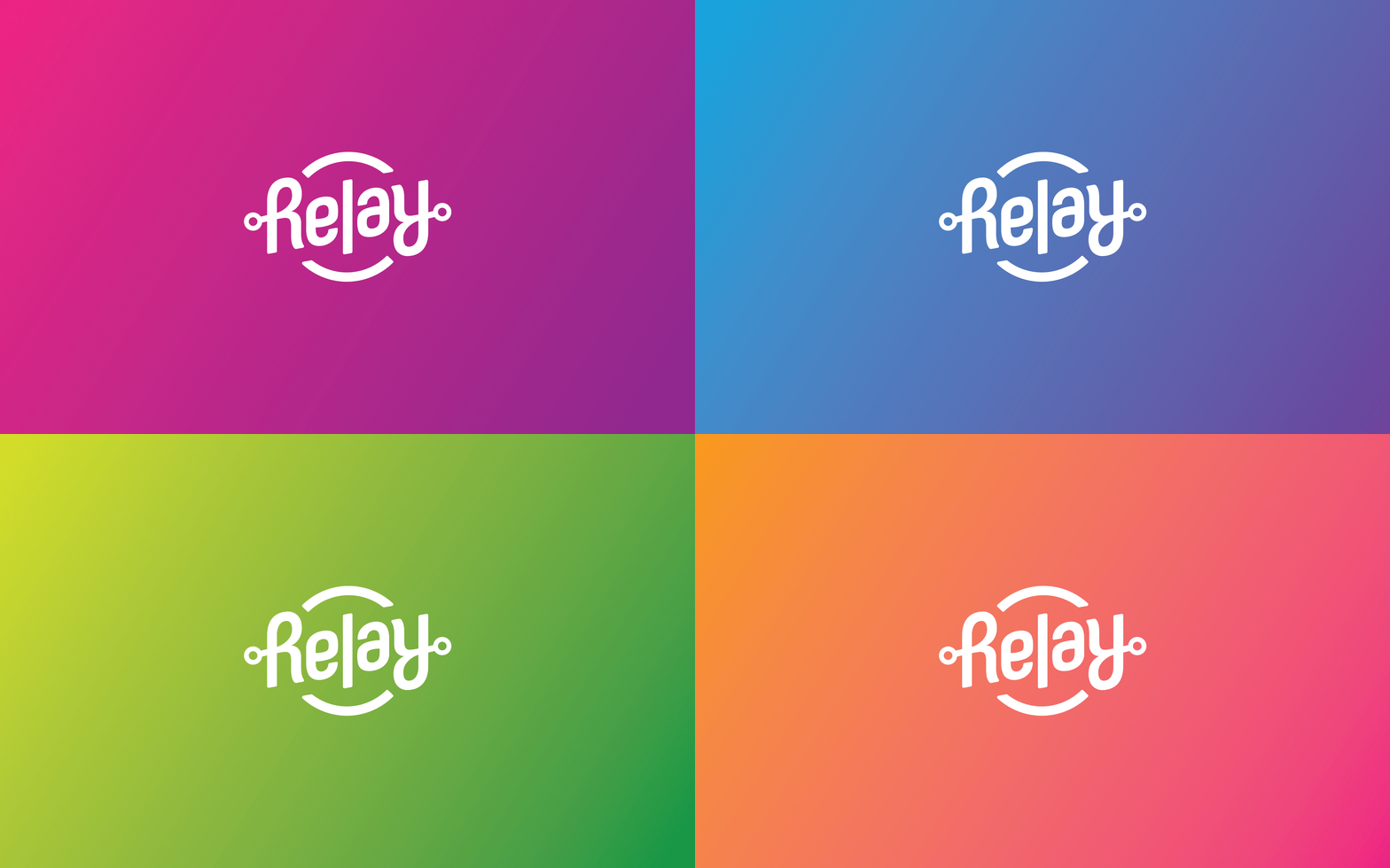
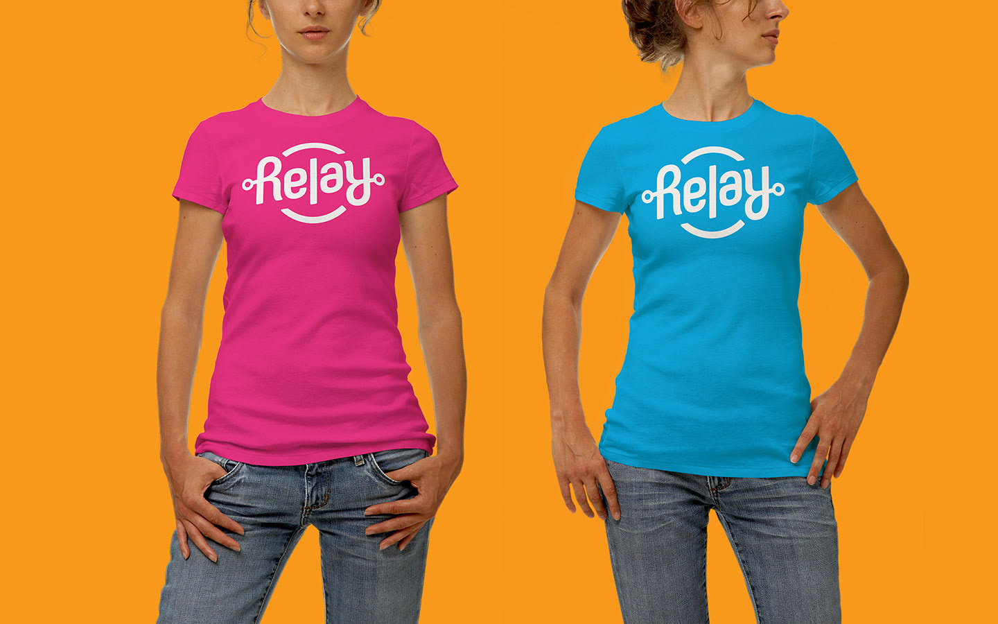
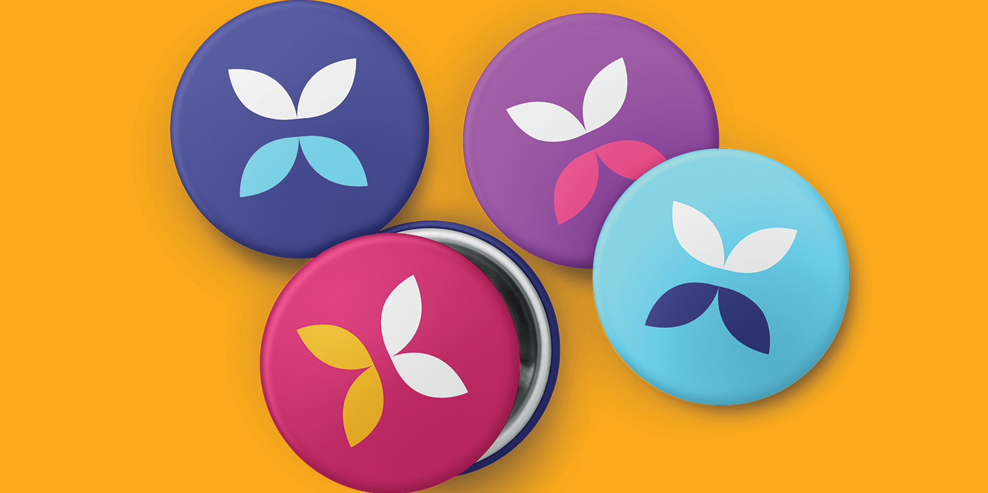
The name is a nod to the generational handover (as in a relay race), the transfer of energy as well as the switch of an electronic circuit. The precious logo had been a pinwheel, and worked well on the wind turbines the kids used.
We developed the idea of having a fun ambigram logo that could be read when spun 180°. When the logo was revealed to kids at the brand launch, it received a literal, audible 'wow'.
This identity was awarded a special designation in the 2018 Adobe Government Creativity Awards.
