
The Brief
Core were approached by Sheffield in 2017 to create a new identity for for the moving and storage company. The task was to reflect the family's century of experience, and convey their vision: offering customers the modern convenience, flexibility, and customisation they deserve. Led by a proud multi-generational team, Sheffield are committed to providing friendly and professional solutions for all moving and storage needs. It was important that the brand strategy and positioning express Sheffield's values of honesty, hard work, and integrity.
Challenges & Goals
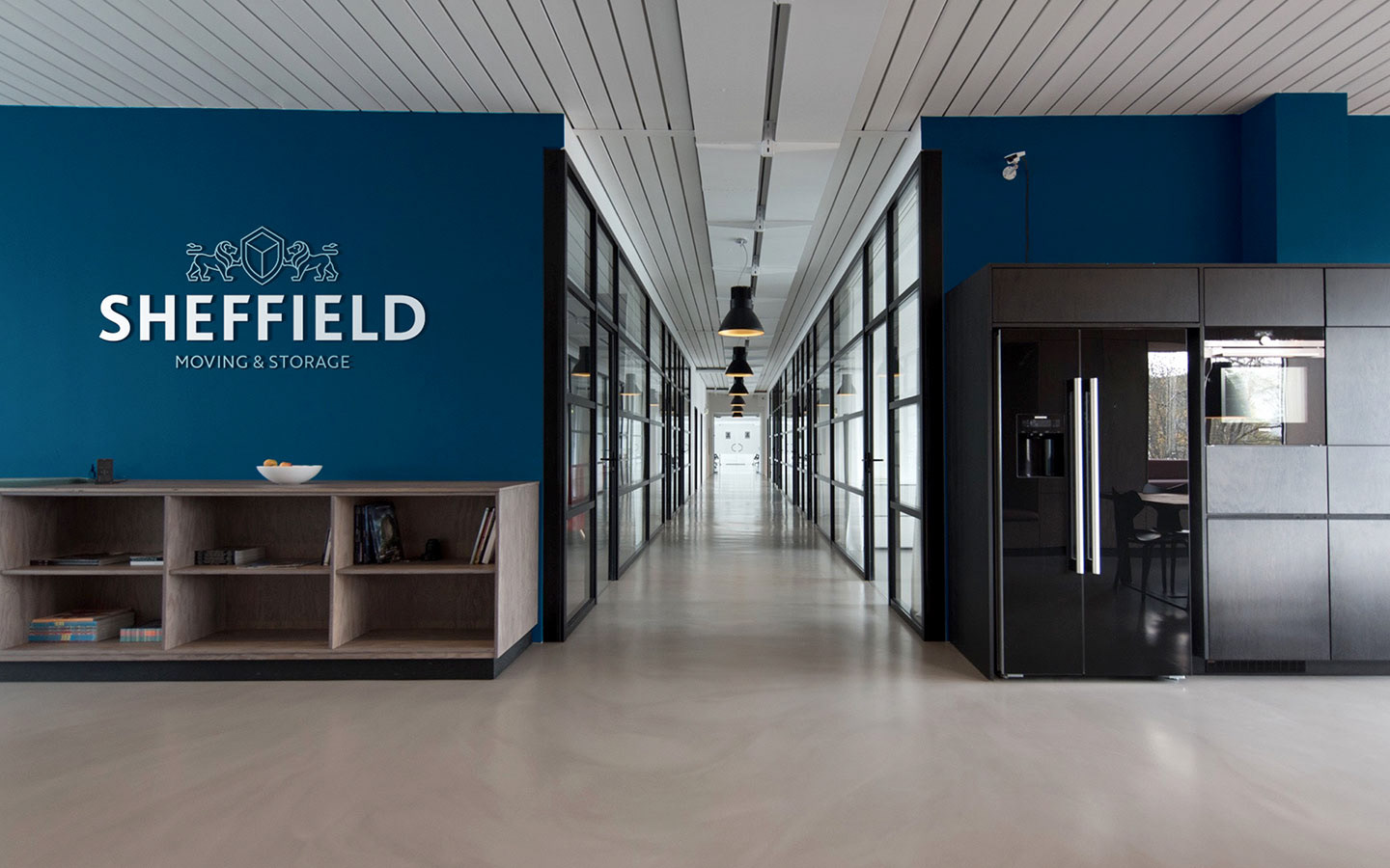
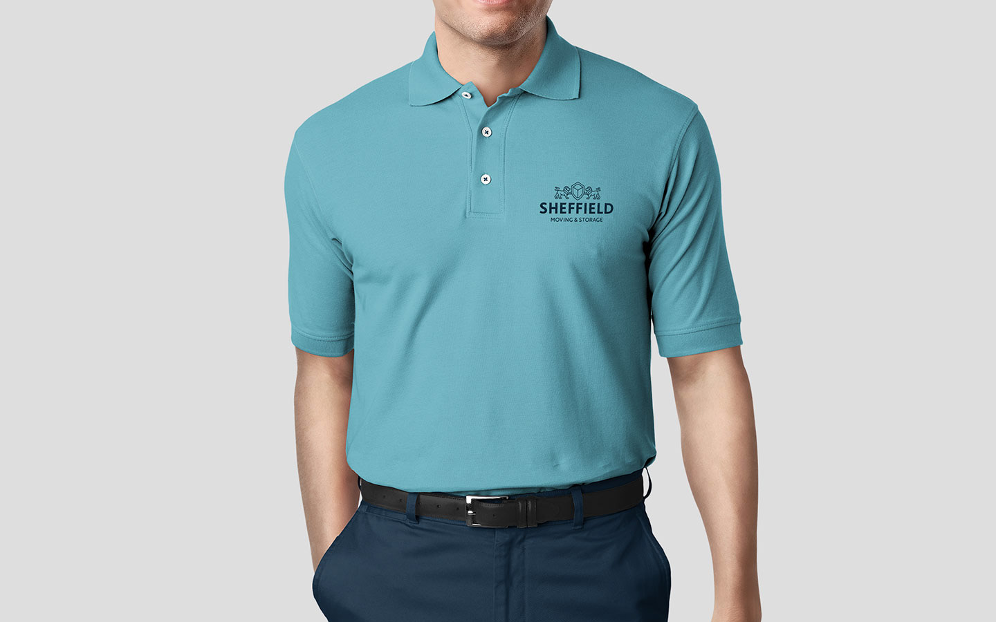
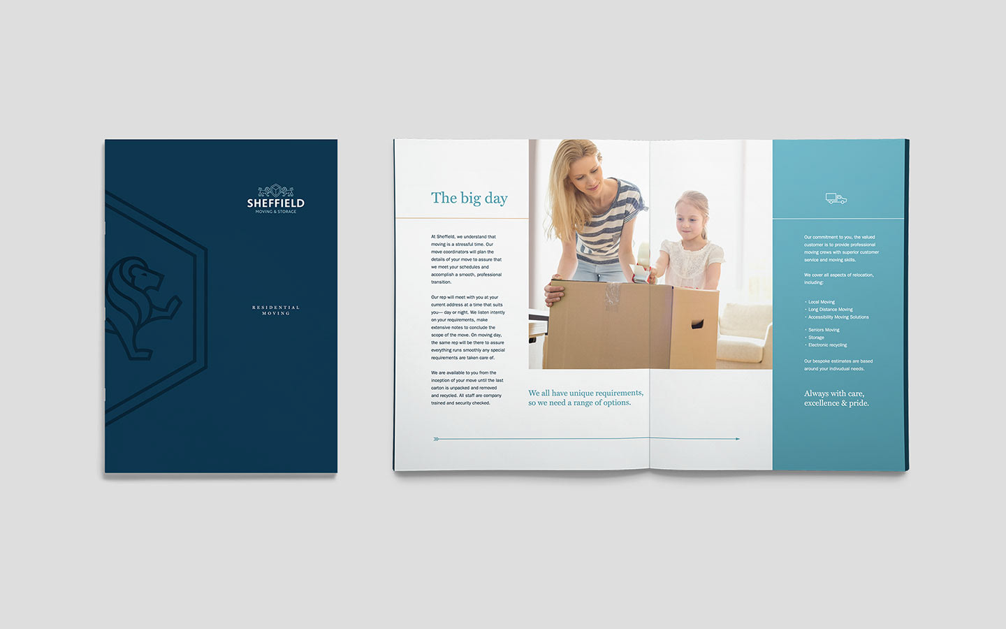
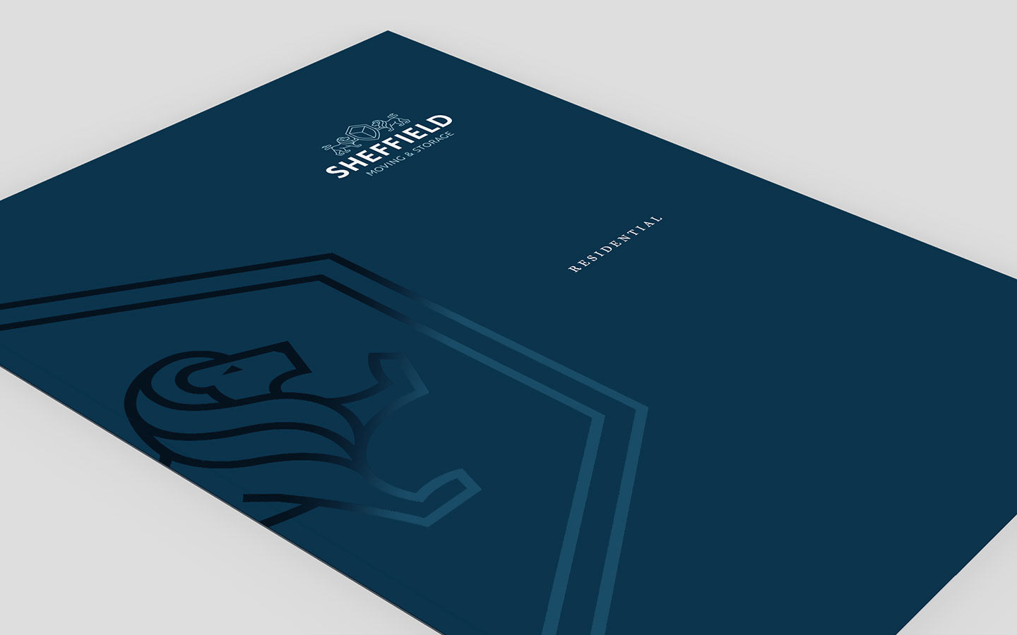
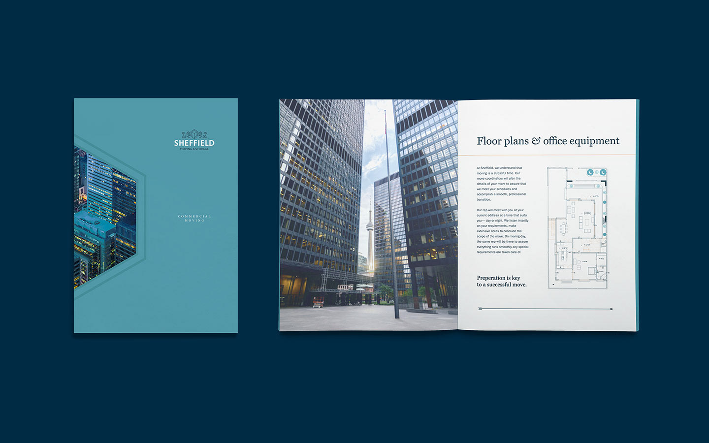
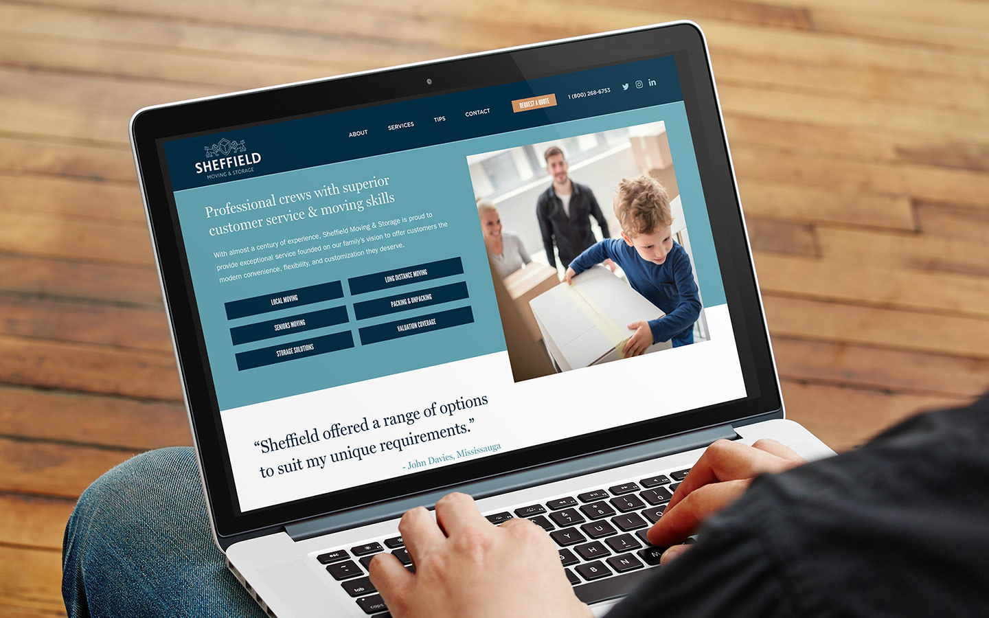
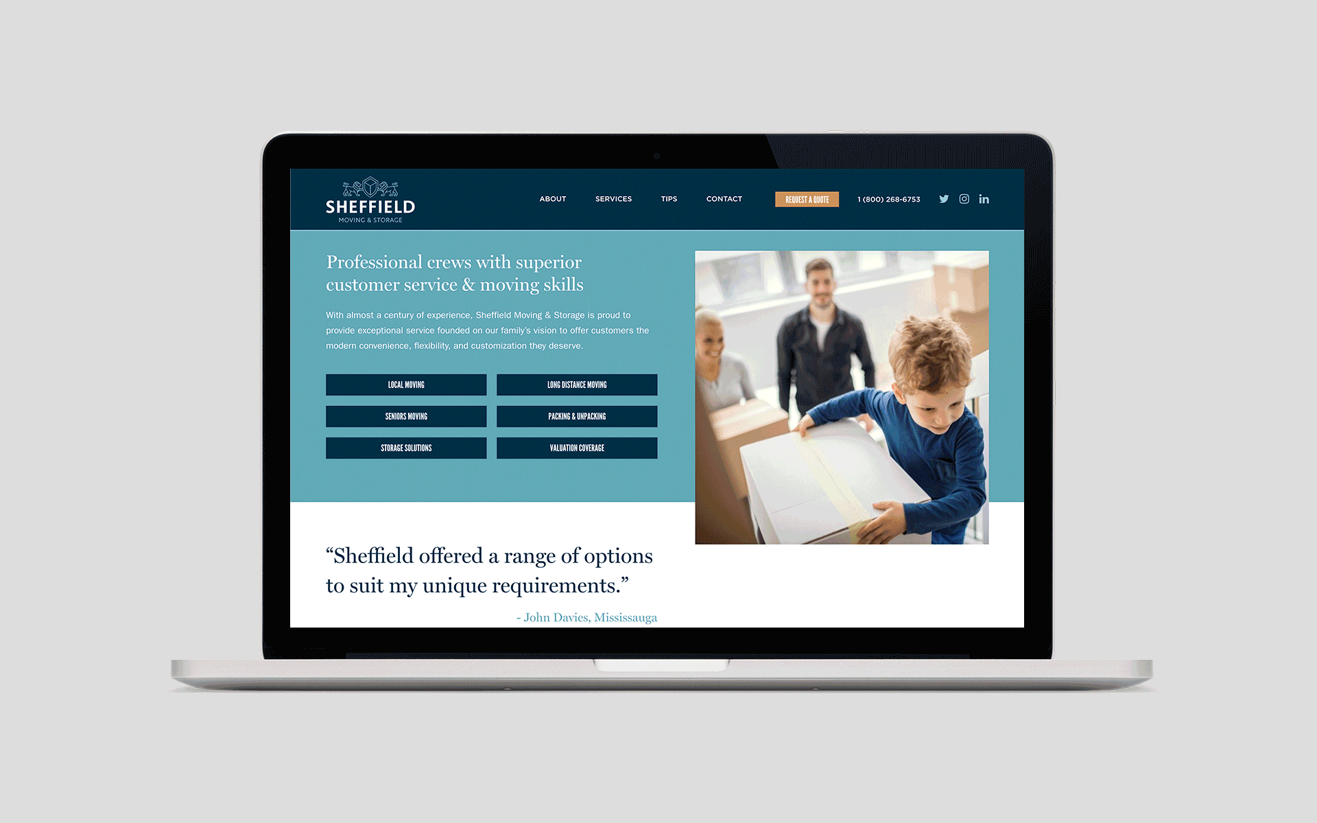
Sheffield provide a personal touch, ensuring everything is done with care and consideration. As such, this had to be reflected across all their many touchpoints — ranging from brochures, website, uniforms, signage and truck livery design. It was essential that all materials were consistent and conveyed a feeling of trust and the assurance that with Sheffield, you can move with confidence.
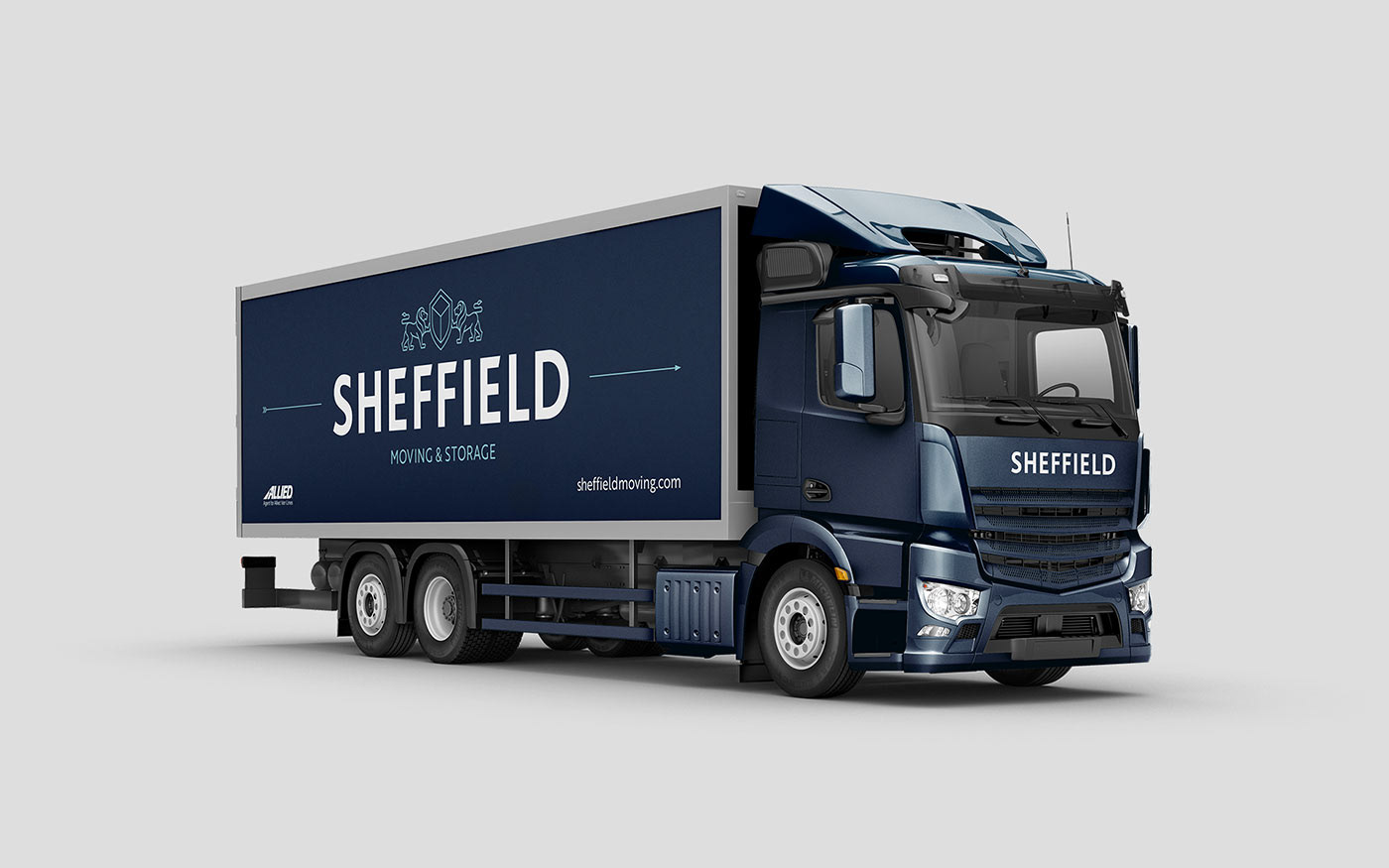
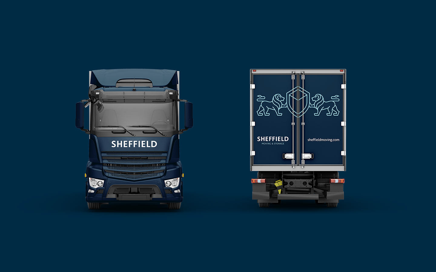
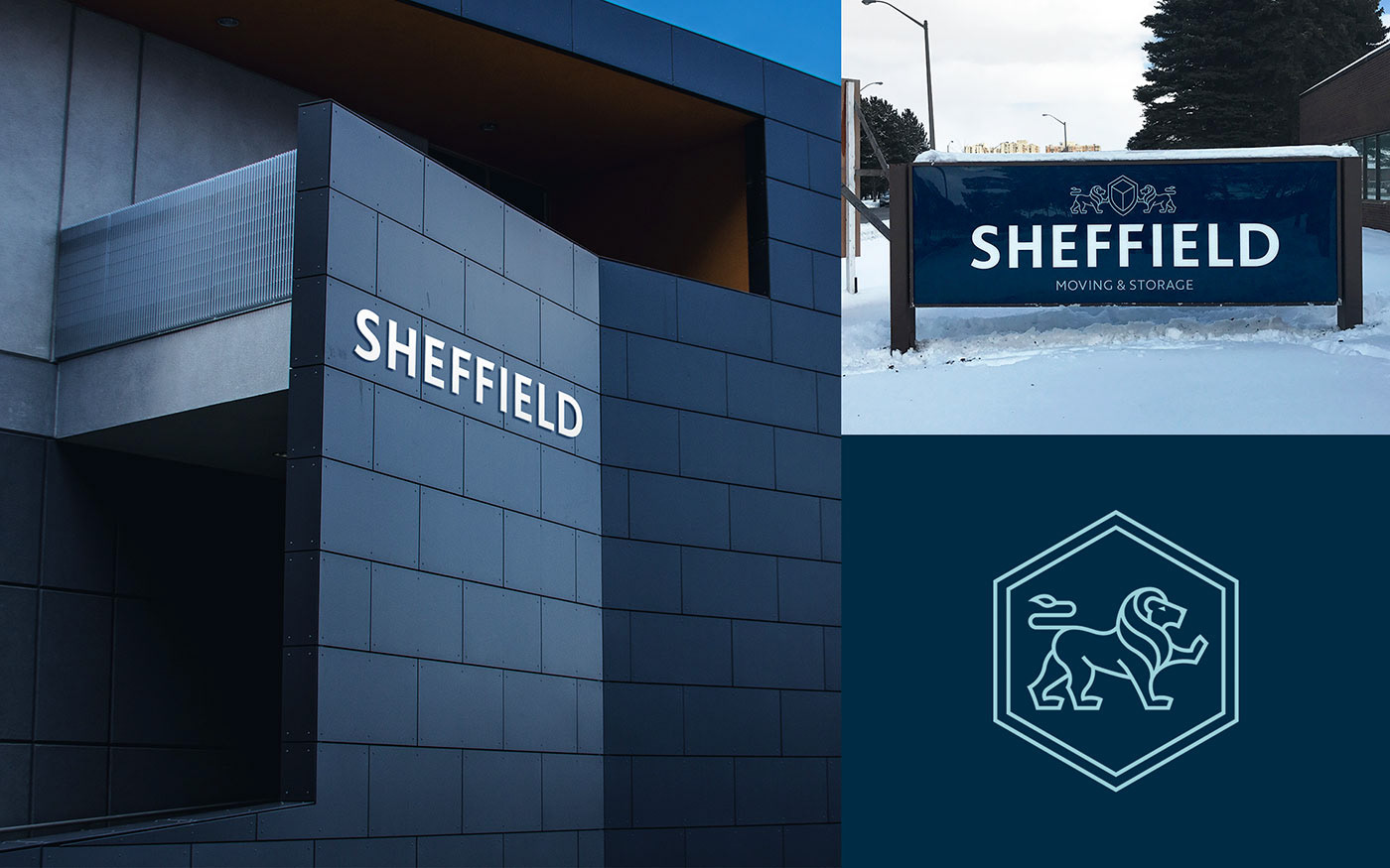
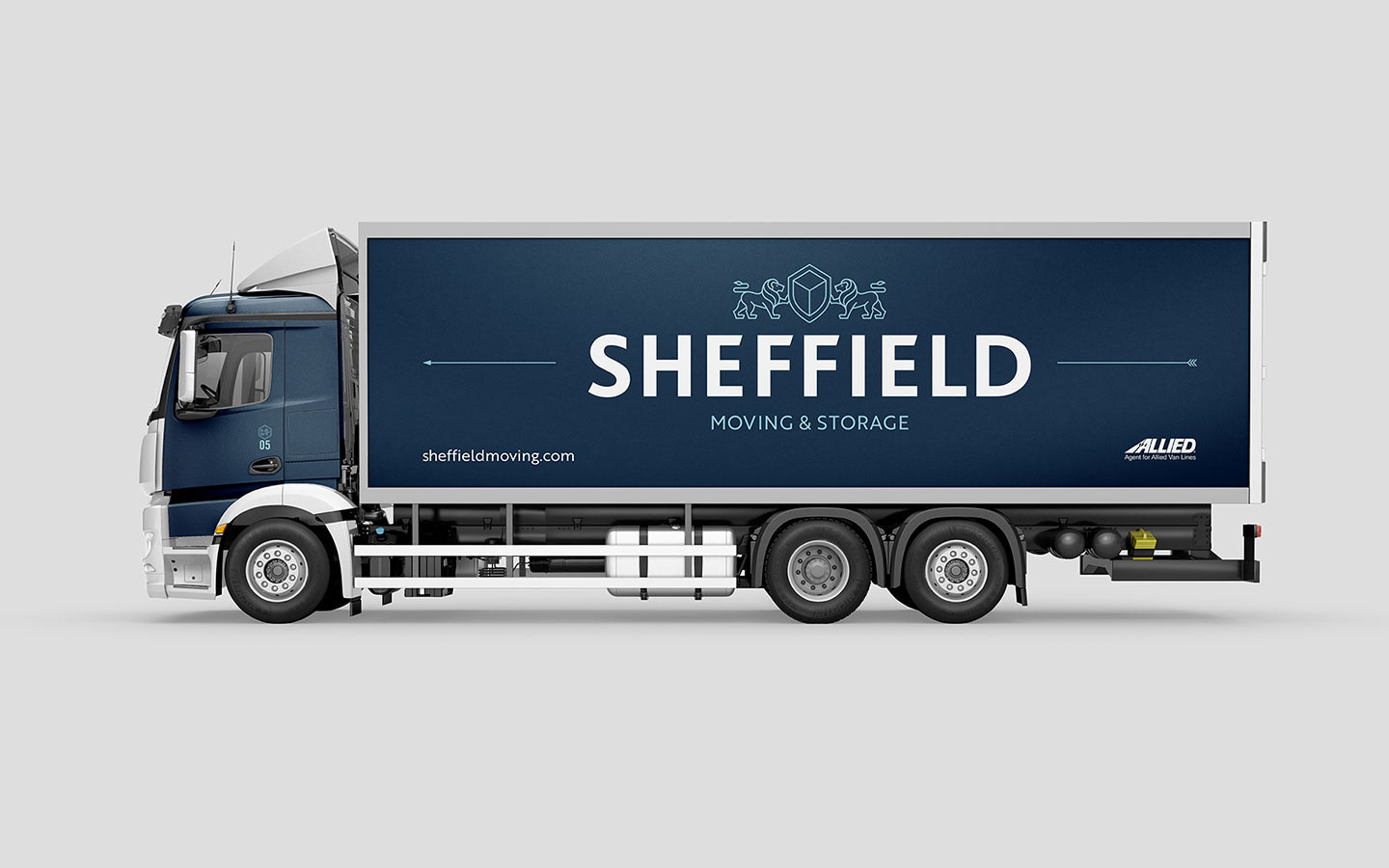
Sheffields trucks could act as large moving billboards, so we made sure that logo was eye-catching and able to read at distance, while moving. Conversely, we also produced some very small collateral, so we created a smaller 'stamp' version of the logo that would also fit into smaller areas, such as a compressed website masthead.
Solution
We combined typography influences from the north of England with a modern dark colour palette to conjure a premium, professional service. The two lions in the logo carrying the shield / 3D box represent the father-son partnership and we utilised arrows as a sleek divider to express momentum. Work for this project included the logo design, monogram, identity system, truck design, uniform design, signage, stationary, flyers, residential and corporate moving brochures, social media content and website layouts.